Navigating to a New vForm Template
Navigate to the vForm Templates section.
Select + New on the command bar.
.png)
A blank template page opens, allowing you to define your vForm template.
Start creating a new vFrom template by first providing a Name for the template and then clicking Save.
.png)
VForm Templates Editor Sections
In the Designer tab, in the Left Panel - you can add questions by selecting a question type from all the options available here.
.png)
The Middle panel is the vForm template editor. You can add in questions, pages, descriptions etc here.
.png)
The Right panel allows you to control various aspects of a form entity (eg: question)
.png)
Creating a new vForm Template
Once you have named and saved the template, you can commence configuring the template.
Start by Specifying the Survey Title and Description.
Next. Specify the Title and Description of the First page of the survey.
.png)
Define the input subtype (such as Text, Email, Number, or Date).
.png)
Quick actions on the question allow a user to manage the question’s properties. The actions are defined below:
Required: Enable or disable the required toggle.
Duplicate: Quickly copy an existing question.
Delete: Remove unwanted questions.
Scroll down on the editor to Add Questions or Pages
.png)
Template Configuration Settings
There are a variety of configuration options both at the form level and at the individual question level that can be set through the Right Panel. These settings govern how the form looks and performs.
General Settings
General Settings are used to define the basic properties of the vForm.
Survey title field is used to set up the name of the vForm.
Survey description field is used to capture a short user understandable description of the vForm.
The admin can choose to make the title and description visible if needed.
The admin can choose to make the survey read-only if needed.
Select a survey language to display the survey in.
The admin can choose to Limit the survey to one response.
The survey width can be decided to fit multiple devices (Auto, Static, or Responsive)
.png)
Logo Settings
Logo Settings are used to change how the logo looks on the survey header on the vForm.
A logo can be uploaded to be shown on the form
The logo height and width can be defined in pixels, percentage, inches, points, etc.
The logo fit can be defined as
None
Contain
Cover
Fill as per needs.
.png)
Navigation Settings
The Navigation Settings are used to define the layout and structure of the vForm.
Set up the Survey layout by choosing any of the four options available
Original Structure
Show all questions on one page
Show single question per page
Show single input field per page
Select First page is a start page to set up the first page of the vForm as a start page.
Auto-advance to the next stage can be selected to advance to the next stage as soon as the user has answered all the questions. This won’t apply if the last question on the page is open-ended or allows multiple answers.
Select Show navigation buttons to display navigation buttons on the page. Alignment for the navigation buttons can be chosen as well (Top, Bottom, Top and bottom)
The form can be customised to display the Previous Page button, Progress Bar, and Table of Contents.
The admin can also customise “Previous Page” button text, “Next Page” button text, and the “Complete Survey” button text.
The Review before submit selection allows the user to preview the page with all or answered questions only before submitting.
.png)
Question Settings
The Question Settings allow you to govern how the questions are displayed in the vForm Template
Question Order selection defines whether the questions are displayed in order or randomly.
Question title alignment can be selected to be Top, Bottom, or Left.
Use the Question description alignment to define where the question description should be displayed.
Use the Question numbering field to alter the numbering for questions on the form.
Question title pattern can be used to define how the question is presented when a question is mandatory or not.
A custom symbol can be used when displaying a question as mandatory.
Error message alignment sets the location of the error message in relation to the question with invalid input.
Select Focus first question on a new page if you want the first input on each page ready for text entry.
Use Restrict answer length and Restrict comment length to manage the length of answers collected.
Comment area height sets the number of displayed lines in text areas for question comments.
Select Auto-expand text areas if you want question comments and long text questions to auto-grow in height based on the entered text length.
Select Allow users to resize text areas to allow users to resize text areas for comments and long text questions only.
.png)
Pages Settings
Pages Settings are used for creating, editing, deleting pages involved in the vForm Template.
Create, Edit, or Delete Pages in the vForm Template using the Pages grid.
The admin can also edit settings like Show page titles, Show page numbers, and Enable grid layout.
.png)
Conditions Settings
The Conditions Settings are used to define dynamic behaviours for the vForm.
Custom Variables can be created as intermediate or auxiliary variables used in form calculations. They take respondent inputs as source values. Each custom variable has a unique name and an expression it’s based on.
Triggers are created as an event or condition that is based on an expression. Once the expression is evaluated to “true”, a trigger sets off an action. Such an action can optionally have a target question it affects.
.png)
Data Settings
The Data Settings are used to manage what happens to the field data once the form is submitted
The Clear hidden question values setting defines whether the values for questions hidden by conditional logic will be cleared or not and when it will happen.
The Update input field values setting defines whether the value is updated when the input field loses focus, or it’s updated in real time, as users are typing.
The admin can choose if they want the survey progress to be auto-saved on page change.
The admin can choose if there is a need to save the “Other“ option value as a separate property.
.png)
Validation Settings
The Validation Settings are used to set up the validation requirements on survey submission.
Set focus on the first invalid answer will highlight the first field with an invalid value.
Run Validation option is used to define when the system will execute the validation
When switching to the next page
After an answer is changed
Upon survey completion
.png)
“Thank You“ Page Settings
The “Thank you” Page settings are used to set up
Redirect to an external link after submission and the Dynamic external link options can be used to redirect users to a specific page once the survey is submitted.
The admin can set up a “Thank You” page to be shown after submission and also customise the markup for the page. One or more dynamic “Thank You“ page markups can be set up to be displayed as per conditions.
The admin can also customise the Markeup to show while survey model is loading and the Markup to show if the user already filled out this survey.
.png)
Quiz Mode Settings
The Quiz Mode Settings are used to present the survey as a quiz.
Select the Use a timer checkbox to enable all the options.
Timer alignment is used to define where the timer is shown on the page.
Time limit to complete the survey is used to set the time interval in seconds after which the survey auto advances to the “Thank You” page. When set to 0, the system will count the time spent on the survey.
Time limit to complete one page is used to set the time interval in seconds after which the survey auto advances to the next page. If set up, this option will hide the “Previous“ navigation button. When set to 0, the system will count the time spent on the current page.
The Timer mode can be selected for Page, Survey, or Both.
.png)
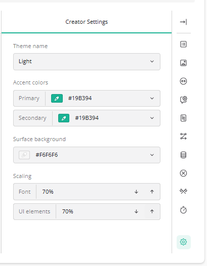
Creator Settings
The Creator Settings are used to change the looks of the vForm Template creation screen. This does not affect how the customer facing form will look like.
Theme name allows the admin to change the theme in use.
Accent colors are used to change the colors used when creating the form.
The Surface background changes the color of the background on the form.
Scaling can be used to change the size of the Form and UI elements on the screen.
Question Level Settings
Select a question type (e.g., Single-Line Input) to add it to your form to then view these settings.
.png)
General Settings
The General tab allows you to configure the core properties and behaviour of the question.
You can configure various options such as making the question
Visible
Read-Only
Required
Simply tick the checkbox if you wish to activate any of these options.
You can also configure key input settings for the question, including:
Input data type
Placeholder text
Autocomplete type
These settings define how the question appears and how users interact with it within the form.
.png)
Layout Settings
The Layout tab allows you to configure aspects related to the question’s layout such as
Collapse state
Alignment
Indentation
.png)
Conditions
The Conditions tab allows you to configure logical rules for a question.
Using this tab, you can control how a question behaves based on specific conditions. For example, you can:
Show or hide the question
Switch the question between read-only and editable
Make the question required
Set or reset the question’s value
Define a default value expression
Apply a value or value expression based on defined conditions
.png)
Input Mask Settings
Input Masks are used to ensure that users enter values correctly in the form fields.
.png)
Pattern can be used to create custom masks using a character-based pattern (e.g., phone numbers +61 999-999-999)
Date and Time can be used to specify the format in which date and time values should be displayed (eg: Date dd-mm-yyyy)
Numeric can be used for ensuring formatted numeric input (eg: decimals, percentages etc)
Currency can be used to format currency field (eg: Prefix “$” and Suffix “AUD”)
Data
The Data tab lets you control how the question interacts with data and dynamic content.
You can configure:
Join identifier – Links the question to a data source field
Set default answer – Pre-populates the question
Set correct answer – Defines the correct response
For dynamic text:
Use display values in dynamic texts – Shows display values instead of stored values
Default display value for dynamic texts – Sets a fallback display value
Additional options:
Clear hidden question values – Removes values when the question is hidden
Update input field values – Keeps the field in sync with data changes
These settings help manage how data is stored, displayed, and updated.
.png)
Validation
The Validation Tab allows users to configure validation constraints for inputs to questions.
.png)