Overview
vForm Templates are the foundation of vForms. They define the structure and content of each survey or assessment form.
Using SurveyJS embedded in Dynamics 365 (D365), users can design dynamic questionnaires with logic, validation, and custom data connections.
Accessing vForm Templates
Follow these steps to access the list of existing vForm Templates in Dynamics 365:
In Dynamics 365, go to vForms in the sitemap.
Select vForm Templates from the left navigation panel.
The Active vForm Templates view displays a list of all existing templates.
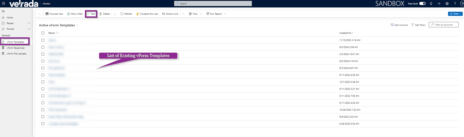
The vForm Templates page lists all available templates with options to create a new one using the + New button on the command bar.
Creating a New vForm Template
To create a new vForm Template:
Select + New on the command bar.
A blank template page opens, allowing you to define your survey structure.
The Designer tab in the vForm Template creation screen lists all available question types on the left panel.
From the Designer tab, add questions by selecting a question type from the left panel.
You can choose from various question types, such as:
Radio Button Group
Rating Scale
Checkboxes
Dropdown
Multi-select Dropdown
Yes/No (Boolean)
File Upload
Image Picker
Ranking
Single-Line Input
Long Text
Multiple Textboxes
Dynamic Panel
Single-Select Matrix
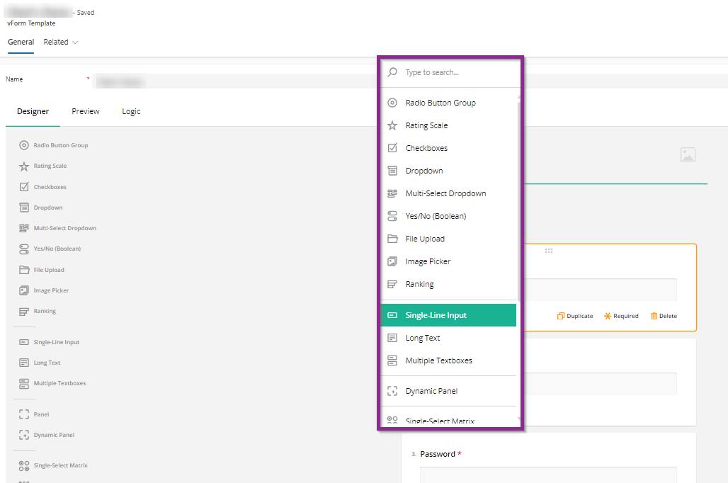
Select a question type (e.g., Single-Line Input) to add it to your form design.
Configure each question as needed:
Define the input subtype (such as Text, Email, Number, or Date).
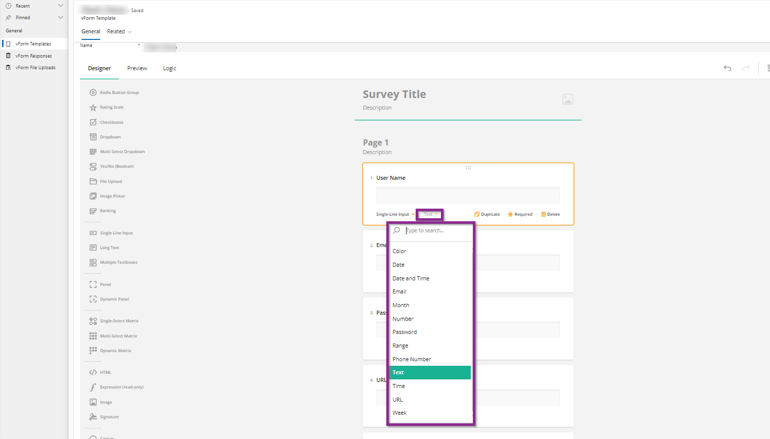
Use the right-hand panel to control question visibility, requirement status, or read-only mode.
Use the right panel to mark questions as Visible, Required, or Read-only. The bottom toolbar allows you to Duplicate, mark as Required, or Delete a question.
Managing Questions
Mark Required: Enable or disable the required toggle.
Duplicate: Quickly copy an existing question.
Delete: Remove unwanted questions.
Visible: Make a question Read-only or Visible from the right panel.
Configuring Question Properties
Each question in a vForm Template can be customised with a variety of configuration options. These properties control how questions behave, appear, and interact with user inputs.
Below are the key configuration panels available under the Designer tab in vForm Templates.
General Settings
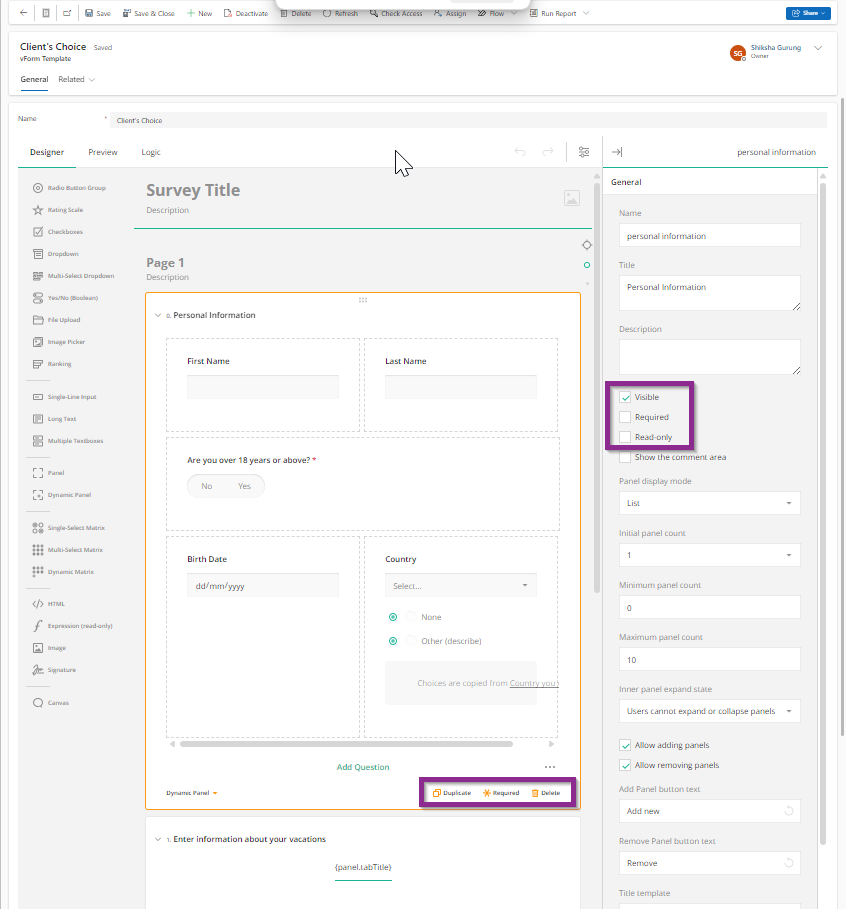
The General section allows you to define the basic properties of a question. You can:
Set a Name and Title for the question.
Add a Description to help users understand the question.
Control visibility and behaviour by marking the question as Visible, Required, or Read-only.
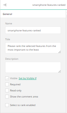
In the General panel, you can define how a question appears and whether it’s mandatory or read-only.
Logic Settings
The Logic section defines dynamic behaviours — when questions should appear, become editable, or display conditional values.
Common fields include:
Visible if: Show a question only when a condition is met.
Enable if: Make a question editable only under certain conditions.
Required if: Dynamically require an answer.
Default value expression: Automatically fill in a value when criteria are met.
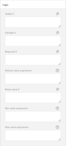
The Logic panel supports multiple expressions for visibility, default values, and validation logic.
Example of Conditional Logic
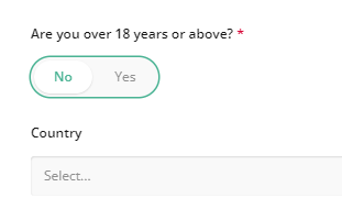
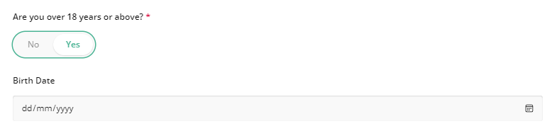
For instance, if the form includes a Yes/No question — “Are you over 18 years or above?” — you can use logic to show the Birth Date field only when the user selects “Yes.”
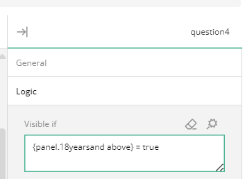
Logic expression: (panel1@yearsandabove) = true — this shows the next field only if the user selects “Yes.”
When ‘No’ is selected, the dependent field remains hidden.
When ‘Yes’ is selected, the Birth Date field appears automatically.
Layout Settings
Use the Layout panel to control the visual arrangement of the question:
Display questions on a new line or hide question numbers.
Choose how panels expand — Inherit, Collapsed, or Expanded.
Configure error message position, indentation, and width constraints.
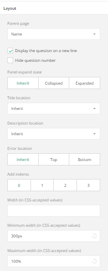
Adjust how questions are presented and aligned within your form layout.
Data Settings
The Data panel controls how information is stored and prefilled.
You can:
Specify the JSON field to store responses.
Define Default Answers or Correct Answers.
Enable Dynamic Text Values for real-time updates.
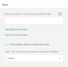
Configure how answers are stored and defaulted within the Dataverse JSON structure.
Validation Settings
The Validation section defines rules to ensure input accuracy.
You can:
Create a custom Required error message.
Add numeric or range validators.
Customise messages for minimum and maximum value breaches.
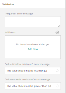
Set clear validation rules and error messages for better data quality.
Choices Settings
If the question type involves selectable options (e.g., Radio Buttons, Dropdowns, or Checkboxes), use the Choices panel to:
Add, rename, or delete options.
Copy choices from another question.
Reorder options or allow “Other”/“None” answers.
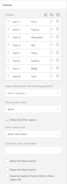
Manage the list of selectable options and add custom “Other” responses.
Choices from a RESTful Service
This feature allows you to dynamically load dropdown or checkbox options from an external source, such as Dataverse or any REST API.
Define the Service URL (API endpoint).
Set the data path and the JSON fields for values and display text.
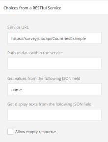
Use RESTful Services to populate dropdowns with live data from your Dataverse environment or external API.
Preview and Logic Tabs
In addition to configuring individual question properties, the Preview and Logic tabs in vForm Templates allow you to test and refine how your form behaves before deployment.
Preview Tab
The Preview tab lets you visualise the form from an end-user’s perspective.
Use it to ensure your questions display correctly, logic triggers work as intended, and the overall layout looks polished.
Steps:
Open any vForm Template.
Select the Preview tab at the top of the form editor.
Review how each section, question type, and logic behaves interactively.
Test visibility, mandatory fields, and page navigation before publishing.
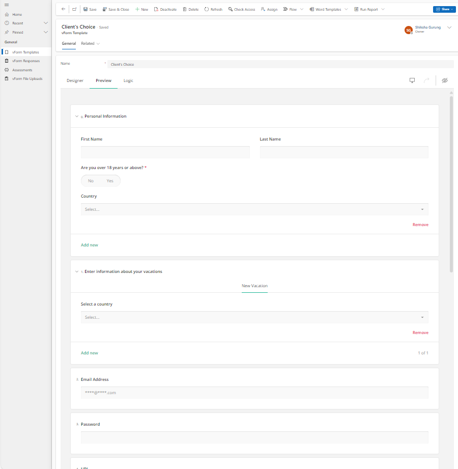
The Preview tab displays how the survey or form will appear to users, including layout, logic, and validation behaviour.
Logic Tab
The Logic tab provides a consolidated view of all conditional rules configured across your form.
It allows you to add, review, or edit complex logic statements that control the behaviour of multiple questions.
Use cases include:
Showing or hiding questions dynamically based on responses.
Enabling or disabling fields when a condition is met.
Making questions required depending on earlier answers.
Steps:
Navigate to your vForm Template.
Select the Logic tab next to the Preview tab.
Review existing logic expressions or select Add New Rule to create additional ones.
Each rule can manage multiple conditions for visibility or requirement settings.
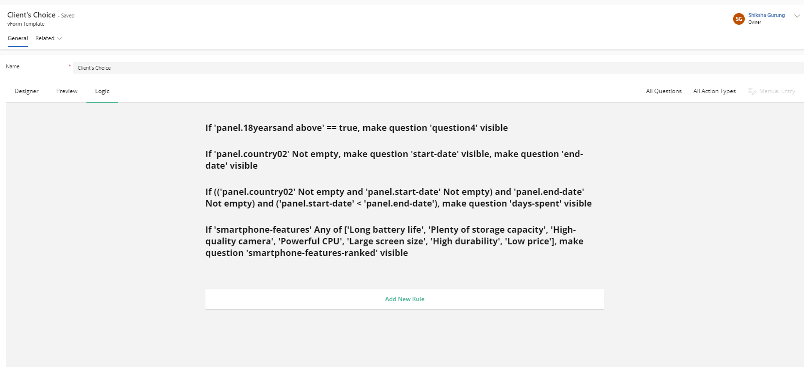
The Logic tab displays all defined logic rules in one place, helping you manage visibility, validation, and workflow triggers efficiently.